
Sharing the meaning behind the making.
Bent Barn’s work has taken many visible forms over the years: visual identities, websites, campaigns, publications, marketing support, photography, video, digital platforms, and ongoing creative leadership.
The deeper thread in my work isn’t about deliverables. It is about understanding what each piece needs to do, how it relates to everything around it, and what kind of structure will help the organization move forward.
These selected engagements all began at different moments of change and produced different outcomes & deliverables.
Each demonstrates a way of bringing greater clarity, continuity, or capability to the work.
SELECTED WORK
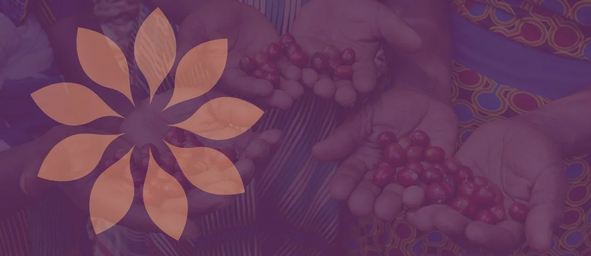
FEATURED CASE STUDY
Building an ecosystem for a growing movement.
Equal Origins
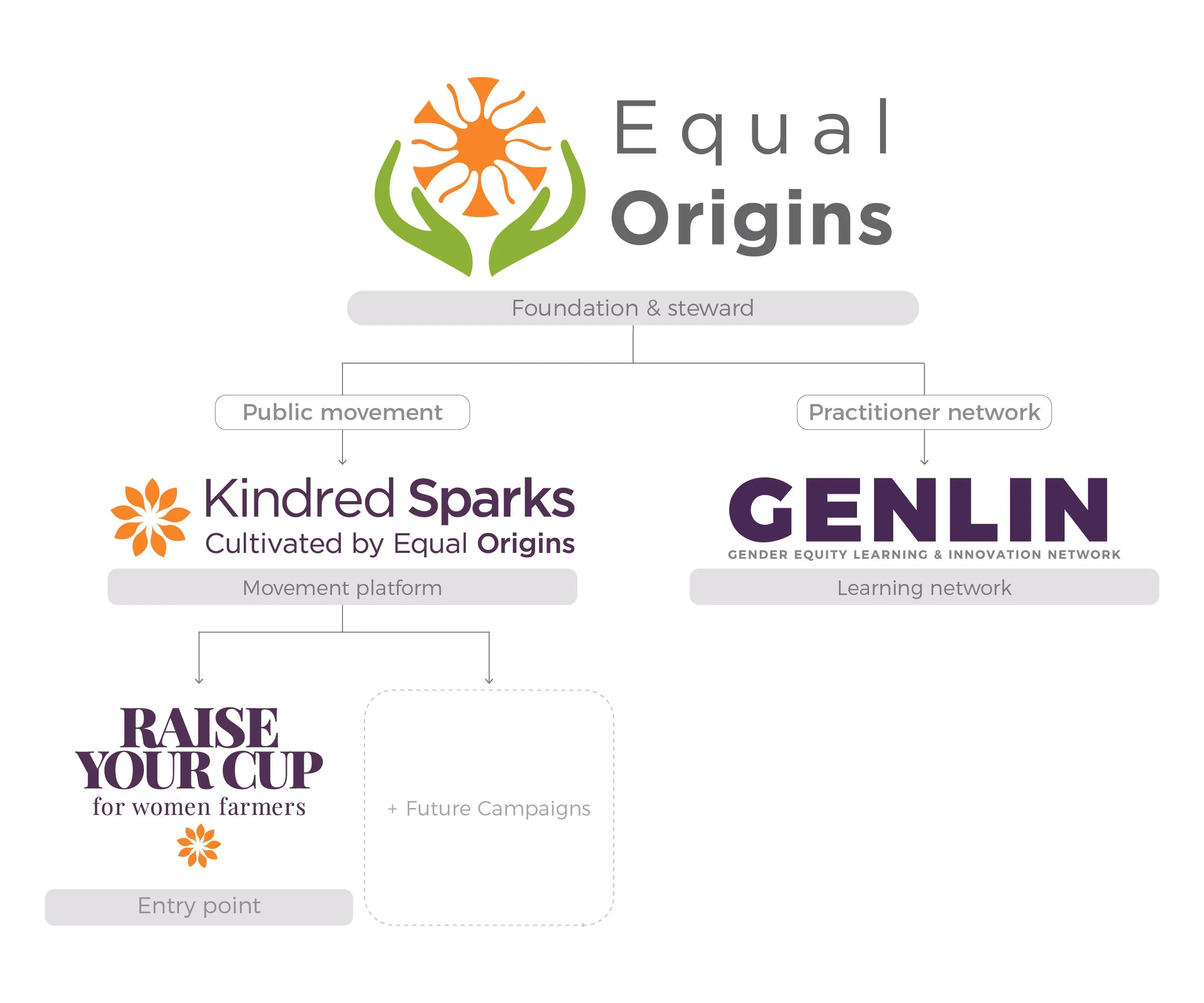
Equal Origins was preparing to reach new audiences through a public movement, campaign platform, and a professional learning network.
What began as a request for a new visual identity revealed a deeper challenge. Each initiative needed enough distinction to fulfill its purpose without drifting away from the credibility and mission of Equal Origins.
Together, we developed an evolving brand architecture that gave each audience a clear entry point while preserving one coherent organizational foundation.
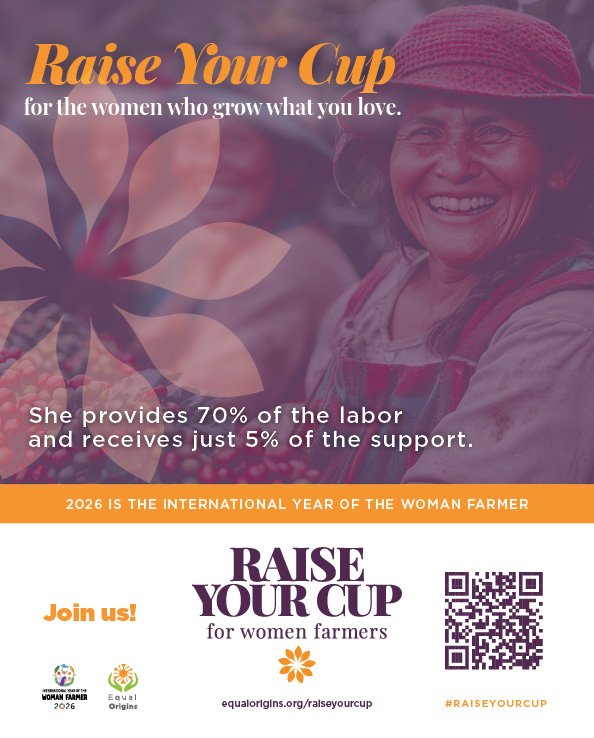
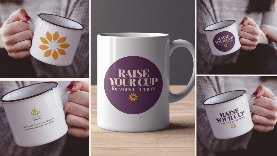
That structure has since supported multiple visual systems, platform launches, campaign communications, digital experiences, and continued organizational growth.
Client: Equal Origins
Sector: Gender equity in coffee and cocoa agriculture
Engagement: Brand Architecture + Multi-Platform Creative Direction
Work included: Strategic Architecture · Visual Identity Systems · Campaign Direction · Digital Platforms · Launch Communications
Outcome: One foundation, two connected pillars, and a scalable ecosystem supporting both public participation and practitioner learning.
What it shows: A visual request transformed into an organizational framework capable of supporting several audiences, initiatives, and future possibilities.
“Aaron combines creative excellence with exceptional customer service. He ensures a high level of satisfaction both in the quality of his work and in the client relationship.”
~ Kimberly Easson
Founder and CEO, Equal Origins
Different starting points, and a shared commitment to consistency.
EXPERIENCE ACROSS THE SYSTEM
Not every client comes to me with a brand-architecture challenge. Sometimes the work begins with a new visual brand identity, a website, a photoshoot, or a recurring creative need.
My most meaningful creative partnerships tend to deepen over time, revealing chances to connect more of the organization’s unique story, tools, and expression.
TRANSLATING EXPERTISE
Giving an extensive body of knowledge a clear and credible expression.
Resonate Strategic Consulting
Dr. Bill Holda brought decades of leadership and organizational experience to a new consulting practice. The challenge wasn’t just creating a new logo, it was to translate a substantial body of knowledge into a distinct, accessible, and professionally coherent presence.
Bent Barn developed the visual identity and extended it through key communication tools, creating a system capable of carrying both the authority of the work and the humanity of the person behind it.
Visual Identity · Communication Strategy · Print Collateral · Digital Direction
What it shows: Intellectual work translated into a visual and communication system people can understand and use.
“Aaron is excellent at developing creative options and producing numerous variations for publicity and recruitment materials. He is willing to spend time, understanding the unique characteristics and strengths that I need to market.”
~ Dr. Bill Holda

LONG-ARC PERSONAL BRAND ECOSYSTEM
Creating a visual language durable enough to support years of evolving work
My creative relationship with Jen began with foundational brand work and expanded across an evolving website, portrait photography, video templates, branded thumbnails, and recurring multimedia support.
Each new expression needed to support a different format or moment while remaining recognizably part of the same evolving practice. Much of that original system remains in use today.
Identity · Website · Photography · Video Systems · Ongoing Creative Direction
What it shows: Coherence across disciplines and a visual foundation capable of outlasting the engagement that created it.

CREATING A DURABLE FOUNDATION
Making technical expertise clearer, more credible, and easier to find.
Crafton & Cox needed an visual brand identity and digital presence capable of communicating technical credibility without losing the character of a founder-led regional company.
Bent Barn created a connected foundation across visual brand identity and web, helping the firm present its expertise more clearly to prospective clients, partners, and search audiences.
Identity · Website · Digital Brand System · Search Presence Support
What it shows: Specialized service work translated into a public presence that feels both credible and accessible.
“Aaron was a pleasure to work with.
He was responsive, attentive to our needs, and produced a great product in a timely manner.”
~ Grant Cox
Principal Engineer, Crafton & Cox
BUILDING ONLY WHAT THE CURRENT CHAPTER NEEDS
Helping an emerging production company build a focused digital home with room to grow.
Squirrel’s Nest Films needed an online presence that could carry its distinctive personality without overbuilding the platform too early.
Bent Barn helped shape the company’s story, visual atmosphere, and one-page digital experience into a concise foundation. Enough to establish credibility now, with room to expand alongside the work.
Brand Translation · Wix Studio Website · Digital Experience
What it shows: A young company’s essential story clarified and expressed at the scale its current stage genuinely requires.
“I was completely blown away by Aaron’s understanding of marketing needs, design and technology. He asked amazingly thoughtful questions to make sure my business website truly reflected the impression I’m trying to make to all of the groups of people who would view it.”
~ Amanda Riley
Founder of Squirrel’s Nest Films
Creative trust that survives shifting roles, teams, and needs.
CONTINUITY THROUGH CHANGE
Bent Barn’s relationship with KFC Global has continued across multiple years, internal teams, leadership changes, technologies, and evolving creative needs.
The work has ranged from branded creative projects to ongoing video-platform stewardship and reporting.
The current scope is focused, but the longevity of the partnership demonstrates something larger: consistency, institutional memory, responsiveness, and the ability to remain useful as an organization changes.
Creative Support · Platform Stewardship · Performance Reporting · Long-Term Brand Continuity
What it shows: A reliable independent partner preserving continuity inside a complex global organization.
THREE DECADES OF MAKING
Strategy grounded in craft.
The strategic practice Bent Barn is becoming is rooted in decades of hands-on work across identity, digital design, editorial systems, campaigns, photography, video, and creative education.
That making experience matters. It keeps the strategy connected to what implementation actually requires: real people, real tools, real timelines, and real constraints.


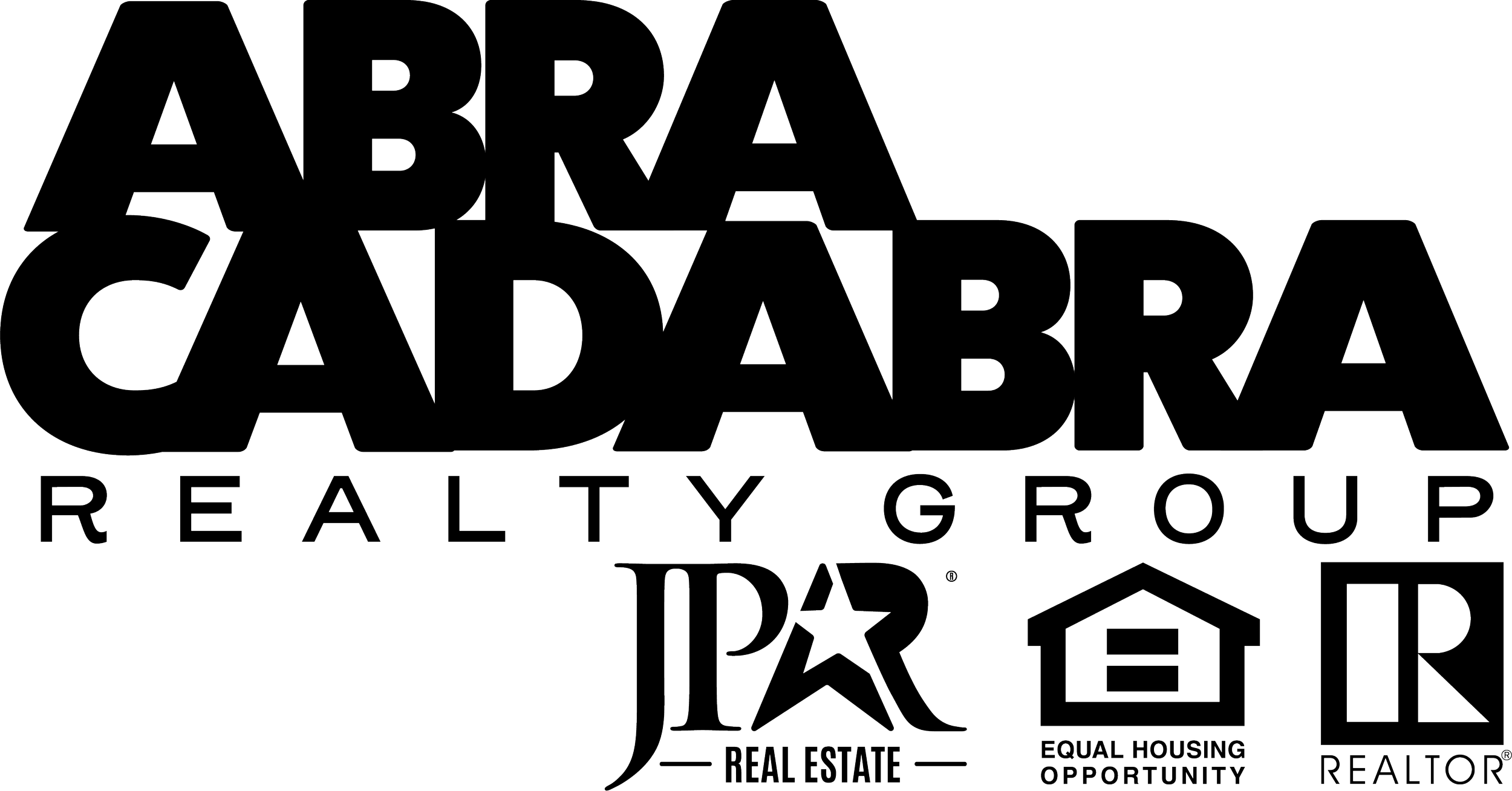
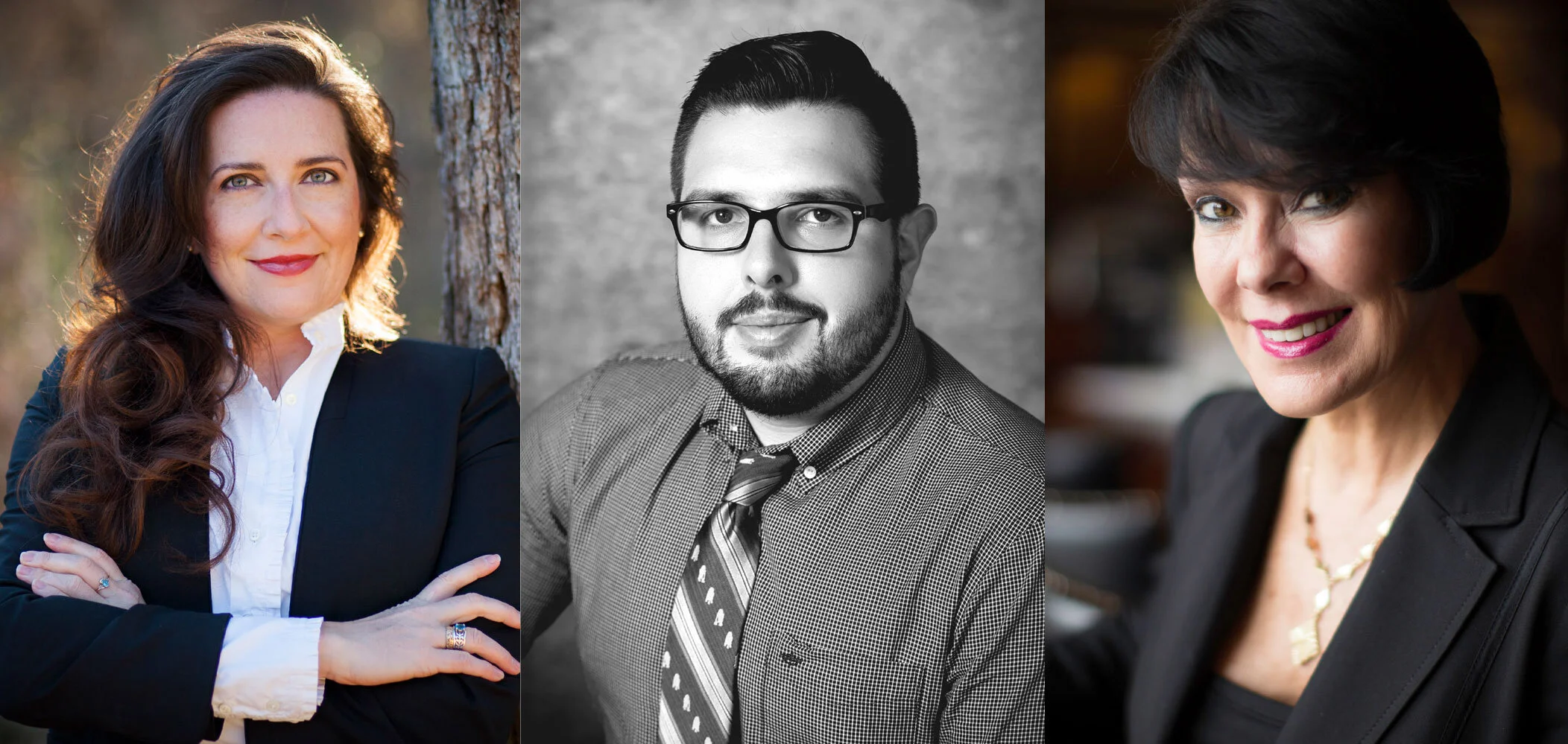
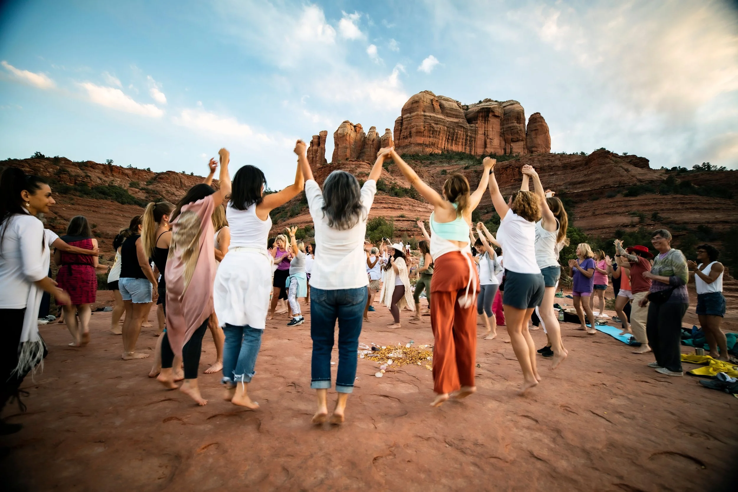
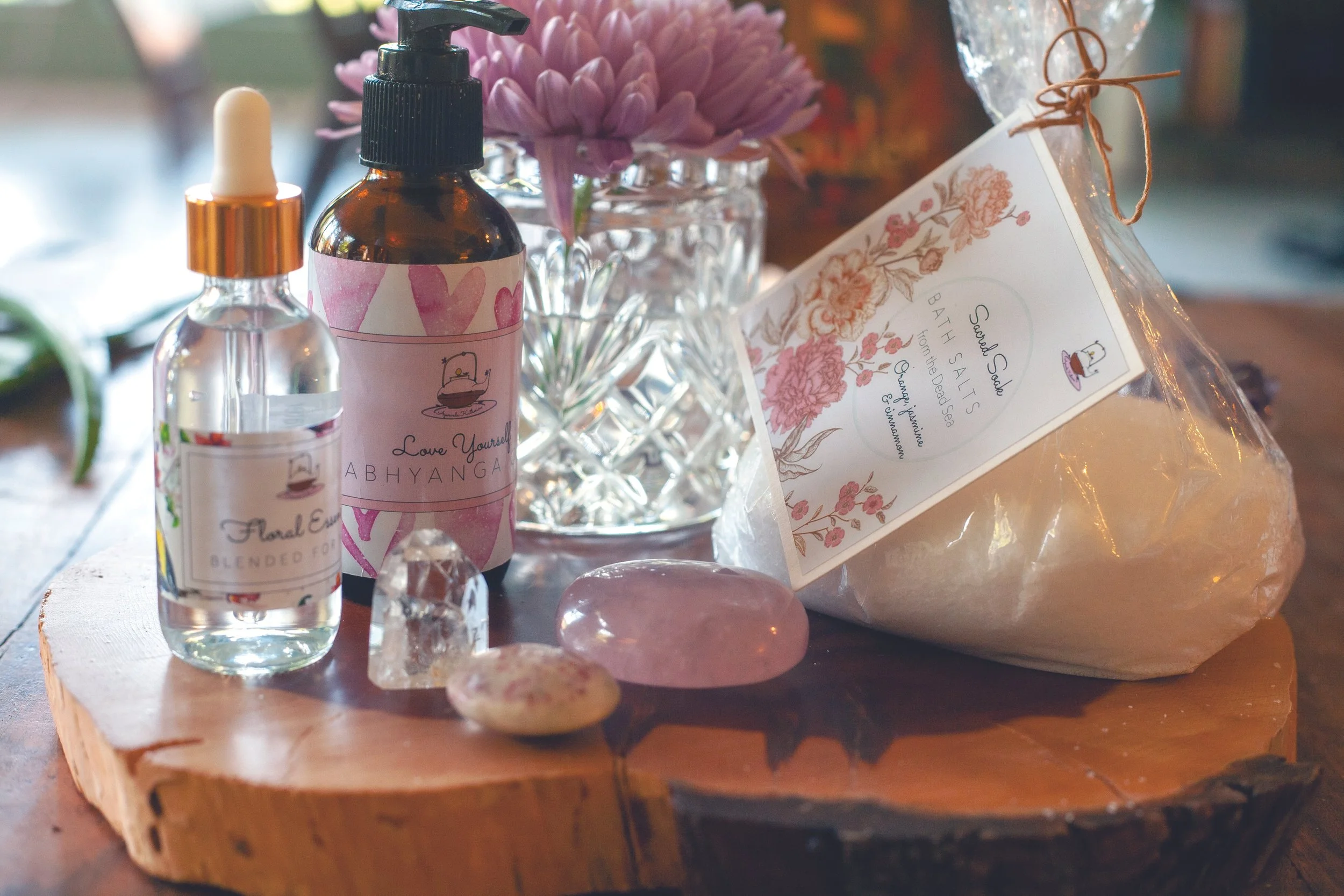

Selected work across identity, digital, editorial, campaign, photographic, and educational contexts, including Legacy Dallas logo, AbraCadabra Realty Group logo, Clean Label Project website design, Vivere Residential logo, Bloom & Balance by Alli logo, and selected brand photography.
What needs to come together now?
YOUR NEXT CHAPTER
You may be preparing to launch something new, trying to clarify several existing parts, or realizing that the structure that brought your organization this far can’t carry what’s coming next.
Tell me what’s changing, and we’ll start by deciding what the work needs.