
EQUAL ORIGINS · CASE STUDY
BRAND ARCHITECTURE · CREATIVE DIRECTION
CLIENT:
Equal Origins
SECTOR:
Gender Equity in Agriculture
TIMELINE:
11/2025 — ongoing
ROLE:
Creative Director & Brand Strategist
“Aaron combines creative excellence with exceptional customer service.”
Building a movement & a network for the women who grow what we love
An ongoing creative direction engagement
How an evolving brand architecture gave Equal Origins the clarity to launch a global campaign and a learning network, during the UN International Year of the Woman Farmer, without diluting their core identity.
DELIVERABLES
Strategic Architecture · Visual Identity Systems · Campaign Direction · Digital Platforms · Launch Communications
ENGAGEMENT
Brand Architecture + Multi-Platform Creative Direction
OUTCOME
One foundation, two connected pillars, and a scalable ecosystem supporting both public participation and practitioner learning.
LAUNCHES
Raise Your Cup + GENLIN
The Challenge
One mission with three stories to tell
Equal Origins is a global nonprofit advancing gender equity in coffee and cocoa agriculture, working across 23 countries and reaching over 500,000 farming families in their first decade. Their tools, research, and partnerships have earned deep credibility with industry leaders from ECOM to the Swiss Platform for Sustainable Cocoa.
But as 2026, the UN International Year of the Woman Farmer, approached, their leadership saw an opportunity to expand beyond industry professionals and reach a wider coalition of allies: cafés, roasters, consumers, and cocoa brands who wanted to participate in the movement but didn't know how.
The challenge wasn’t a logo design. It was organizational clarity. Equal Origins needed to launch a new movement network (Kindred Sparks) and an entry-point campaign (Raise Your Cup), and, soon after, a learning platform (GENLIN), without confusing existing partners or diluting the parent brand that gave them credibility in the first place.
The Insight
They needed more than a logo; they needed brand architecture
When I began working with the Equal Origins team, the initial brief felt familiar: design a visual identity for a new initiative. But as I listened to stakeholder conversations with CEO Kimberly Easson, communications consultant, café partner, and board chair (past and present), I kept hearing the same tension surfacing in different ways…
The disagreements weren’t really about the aesthetics. Mostly, they were around the organizational strategy.
Each stakeholder had a different mental model for how the new brand should relate to Equal Origins. Some wanted separation; others wanted tight alignment. Everyone was exactly right about their piece of the puzzle.
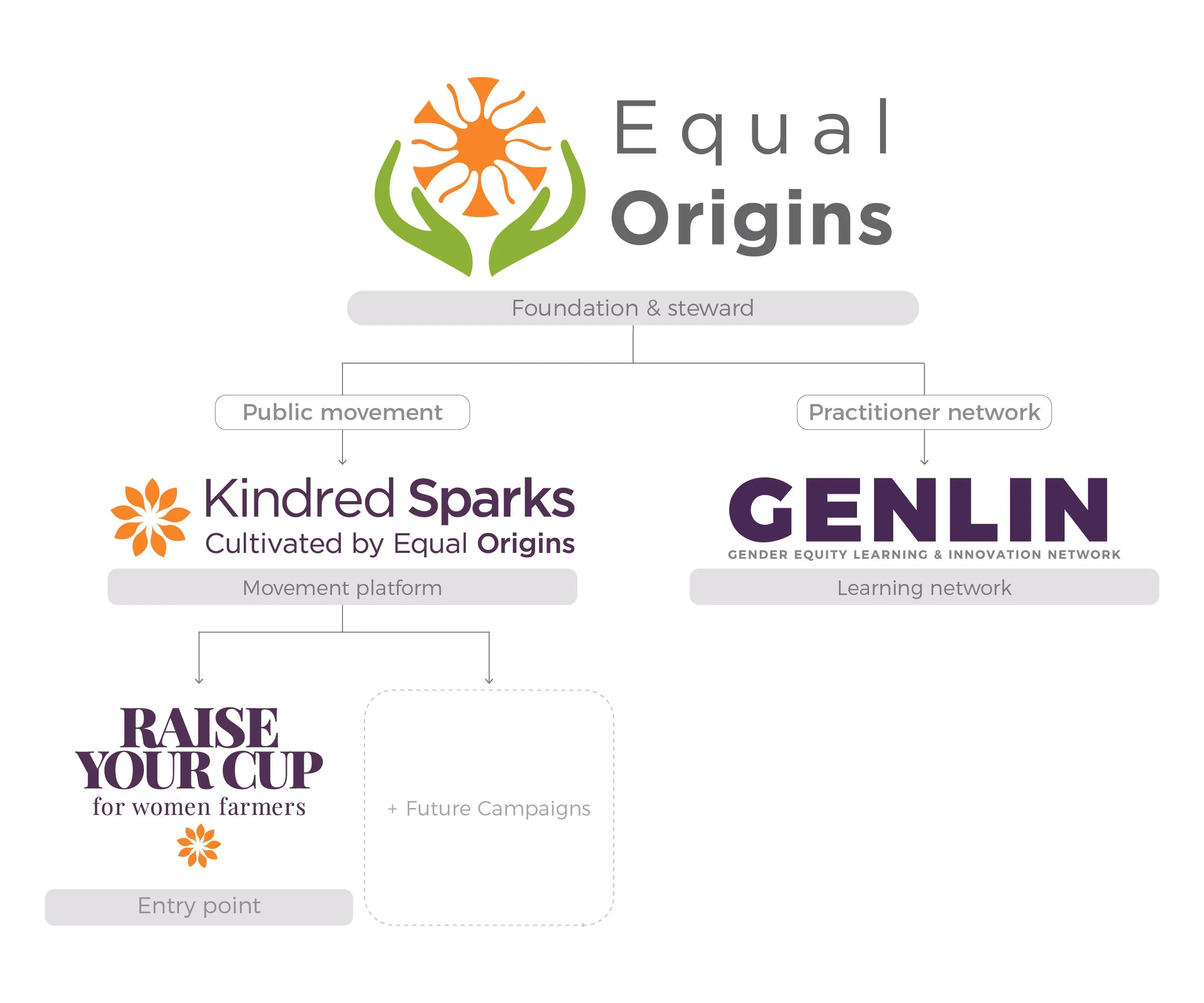
The breakthrough was realizing the project needed a framework before it needed a font. I created a three-tier brand architecture that would give each audience their own entry point while keeping everything rooted in Equal Origins’ credibility and mission…
The Solution
Three layers, one ecosystem
Each layer serves a distinct audience, carries its own visual identity, and connects back to the mission through clear attribution, creating a brand ecosystem that can scale without fracturing. This three-tier system became the foundation. What came next broadened it…
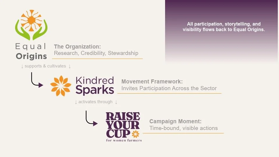
The movement architecture behind the Raise Your Cup + Kindred Sparks campaign: Equal Origins as the foundation, Kindred Sparks as the movement platform, Raise Your Cup as the public on-ramp. Three layers of one ecosystem.
-
The Foundation & Steward
The organizational brand. Research, tools, industry partnerships, and the Gender Equity Index that gives everything else its credibility. This is the brand funders trust and SWISSCO members rely on.
-
The Movement Platform
A network connecting coffee and cocoa industry allies — cafés, roasters, brands, and advocates — to the mission. Carries its own visual identity using Equal Origins' botanical hands motif with a distinctive spark mark and purple palette.
-
The Campaign Entry Point
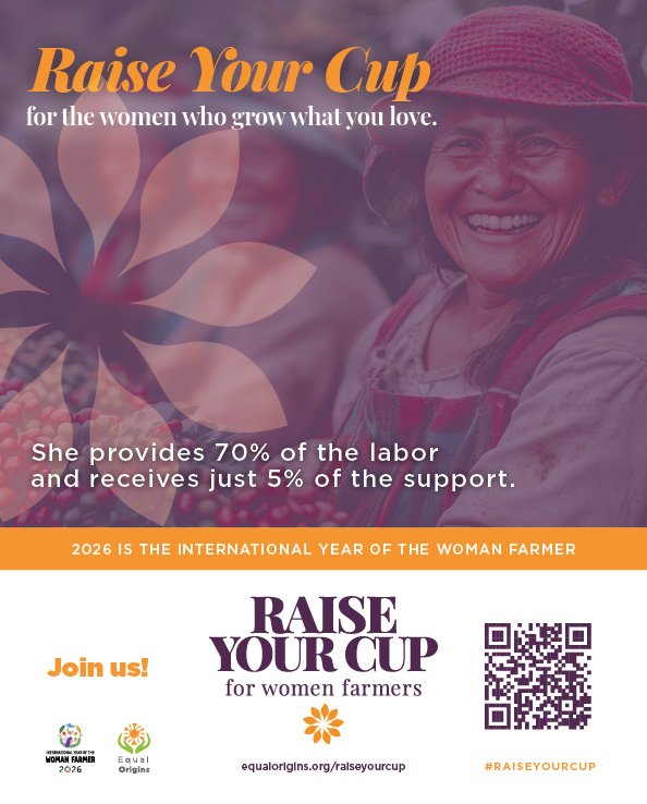
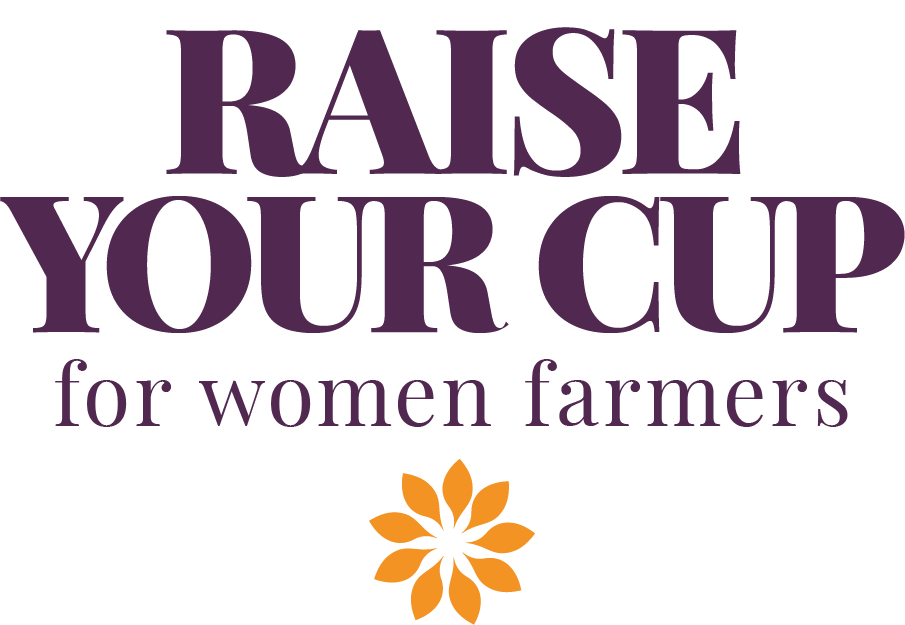
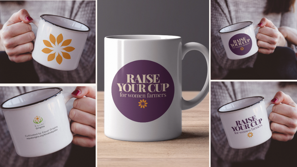
The Raise Your Cup campaign is a public-facing activation. A low-barrier, high-signal campaign that invites everyone, from coffee shop owners to morning commuters, to participate in the movement with a single, universal gesture: raising their cup for women farmers.
Chapter one: THE Raise your cup + kindred sparks CAMPAIGN
From framework to field-ready
With the architecture resolved, the visual system came together with purpose. Every design decision could be tested against the framework: does this serve Layer 1, 2, or 3? Does it strengthen the relationship between them (or create confusion)?
The Kindred Sparks identity borrows Equal Origins’ botanical hands motif, maintaining visual kinship, while introducing a new “spark mark” and elevated purple palette that distinguishes it as a movement brand. The Raise Your Cup campaign uses warm, accessible typography that feels inviting to consumer audiences while staying rooted in the agricultural story.
Chapter TWO: THe GENDER EQUITY LEARNING & INNOVATION NETWORK
Extending the architecture: a second pillar emerges
By early 2026, Equal Origins had a launch on the calendar and a new question on the table. The first arc of the architecture was holding: Kindred Sparks had its identity, Raise Your Cup had its activation, and partners were stepping in. But the deeper work — the convening, the cross-sector learning, the research-into-practice translation Equal Origins had been quietly doing inside the industry for years — still didn't have a home of its own.
My first instinct was to call it a fourth tier. One more layer stacked onto the system I'd already built.
But this was a second pillar.
This distinction mattered. The architecture I’d initially built reached wider: Equal Origins at the foundation, Kindred Sparks as the movement platform, Raise Your Cup as the public on-ramp — each layer opening toward a broader, more public audience. GENLIN reached deeper, toward the practitioners already inside the work. It didn’t belong as a fourth rung. It rose beside the entire movement, from the same foundation, in its own right.
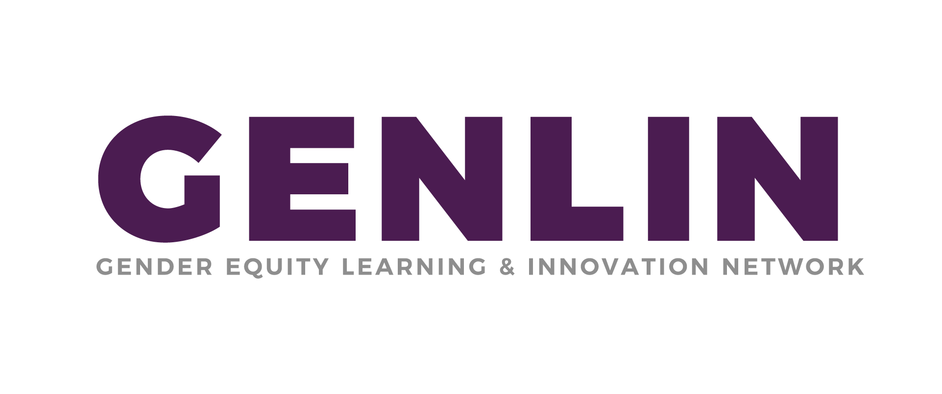
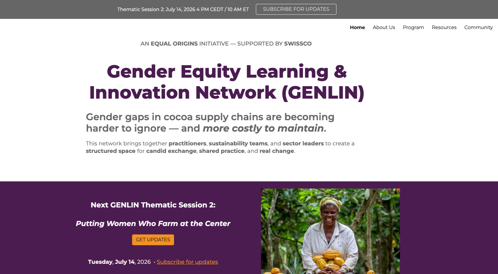
GENLIN, the Gender Equity Learning & Innovation Network, would be that home: a structured space where practitioners across coffee, cocoa, and adjacent supply chains could gather, learn, and build new approaches together. Distinct from the public campaign. Distinct from the partner network. Unmistakably part of the same ecosystem but with a different purpose and audience.
A new identity, in the family,but standing on its own
This is where the second-pillar logic showed up in the design. Kindred Sparks intentionally borrows Equal Origins’ botanical motif . It's an endorsed sub-identity of EO, wearing the family resemblance where is kinship does the work.
GENLIN needed something different: an identity recognizable, distinct, and institutional enough to convene practitioners as a credible body in its own right, without drifting from the parent brand that vouches for it. The solution clarified into a palette of purple, orange, and white: enough shared DNA to read as kin, enough restraint to read as grounded, established, its own thing.
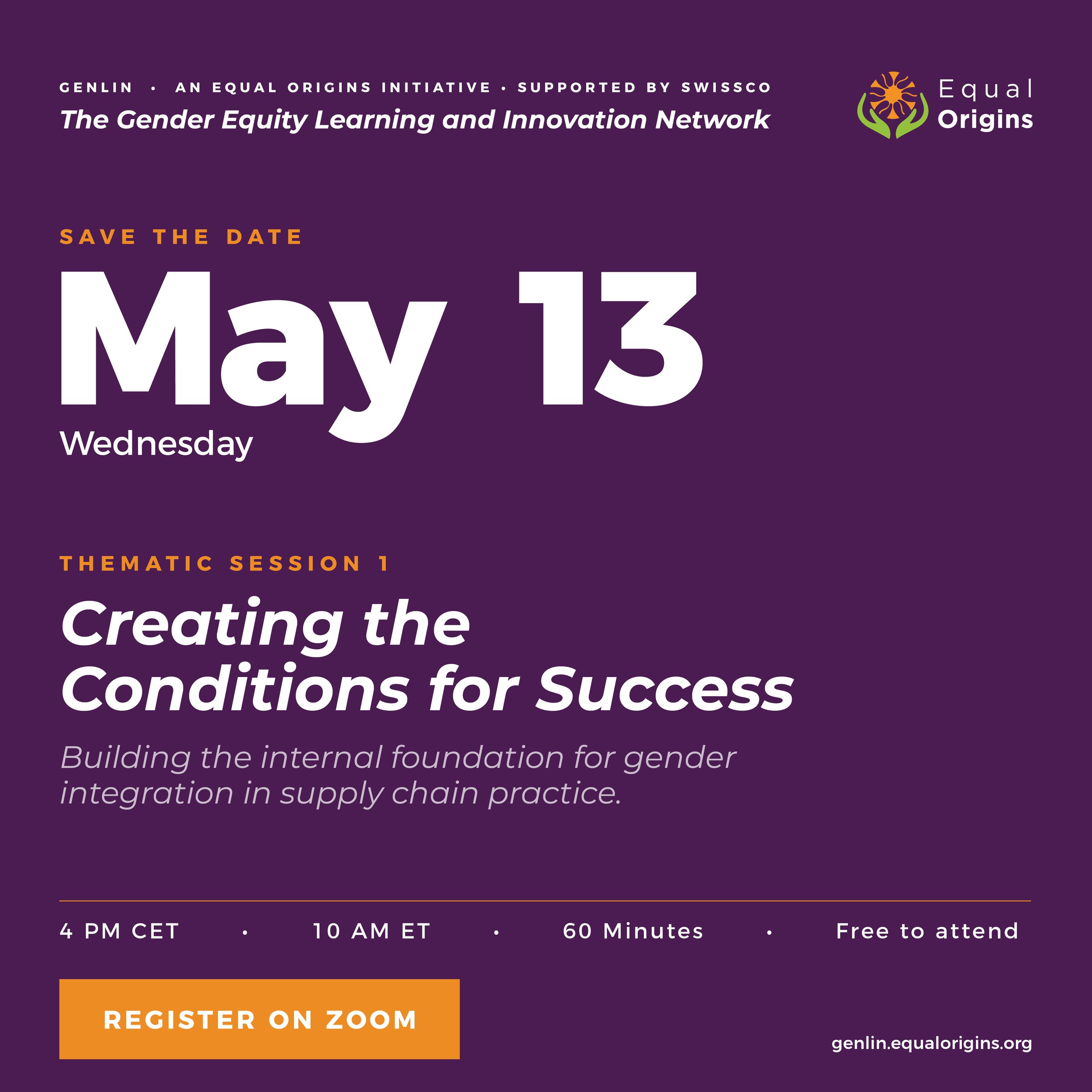
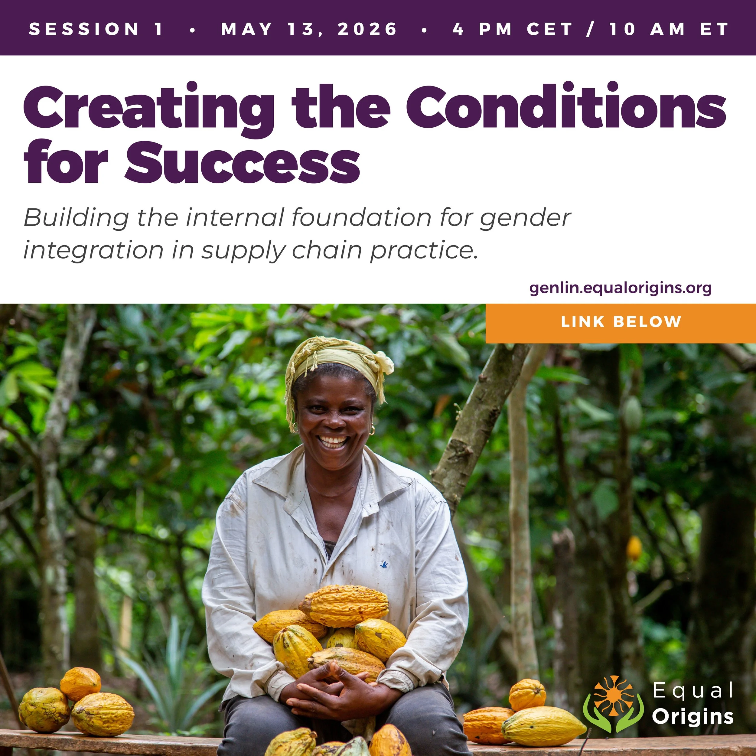
Launching the first session
Session 1 launched May 13, 2026, behind a coordinated rollout: a pitch sheet iterated across multiple stakeholder rounds, an e-blast series to the Equal Origins network, a resource library seeded with the first wave of practitioner materials, and a steady drumbeat of LinkedIn and partner communications that built anticipation through April and into May.
The second pillar was live. The architecture hadn't just grown taller, it had grown a whole new limb. And the foundation was firm.
The architecture, fully grown: one foundation, two pillars with a public movement and a practitioner network, both rooted in Equal Origins.
Deliverables
What we created
Phase 2: GENLIN Launch
GENLIN Visual Identity System
Google Sites Platform Build
Programmatic Slide System
Pitch Sheet System
E-Blast Campaign Series
Resource Library Architecture
Session 1 Launch Communications
Phase 1: Brand Architecture + Raise Your Cup Launch
Brand Architecture Framework
Kindred Sparks Identity
Raise Your Cup Campaign
Café Print Materials
Digital Extensions (WordPress, Givebutter, social toolkit,
webinar deck)Merch & Campaign Assets
Reflection
What this engagement keeps teaching me
The best design solutions often aren’t visual. Stakeholder tension almost always signals a structural problem, and if WE solve that first, the visual identity practically designs itself.
This engagement confirmed something I’d been sensing for a while: the most valuable thing I bring to creative partners and mission-driven organizations isn’t pixel-perfect logos, it’s the ability to listen across competing stakeholder needs, find the framework that makes everyone’s vision possible, and stay long enough to steward it as it grows.
Equal Origins didn’t need me to design a suite of new logos, but they did need a new way of thinking about their brand identity and help with shaping something new. Over the course of two launches, one architecture, and a second network pillar none of us knew the extent of what we would build together when we first started; that thinking has become the through-line of one of the most meaningful long-arc engagements of my career.
That’s what brand architecture does, at this scale. It looks good, it makes movement possible, and it keeps making it possible, layer by layer, as the work continues to grow.
Work With Bent Barn Studio
Does your mission need clarity?
Aaron and the Bent Barn team helps creative partners and mission-driven organizations untangle complexity and build brand ecosystems that mobilize the right people around shared values.